From the user flow, I derived how the pages should look like for the mobile application and what components are needed for each page. I drew sketches to help established the base design of the application.
After adding interactions for the wireframes above, I conducted usability testing with 5 users. Each users were given 3 different tasks to complete.
Task 1: Add a location to the suggestion list
Task 2: Invite a friend to collaborate
Task 3: Vote on locations user wants to go to
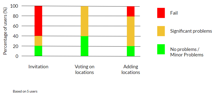
From the test, I observed that many users were unable to complete their task or faced great difficulty in completing their tasks. Based on the observations during the test, I organized my insights into pluses and deltas to understand what are the usability problems that users are facing.

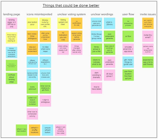
There were many areas that were hindering from completing their tasks successfully as shown in the image above. They are main categorized into:
- List of landing page is misleading
- Icons misinterpreted
- No clear indication/confirmation of vote
- Words were misinterpreted too
- User flow was messy, not clear how a happy path is supposed to be
- Many diff perceptions on how to invite friends
I tackled these issues and made the necessary improvements on the prototype. Furthermore, adding more pages in between to help facilitate users transition across different functions. In addition, I created an empty state that help first-time users understand how to use their application as well. You can click on the button below to interact with the 2nd version of the prototype.
View prototype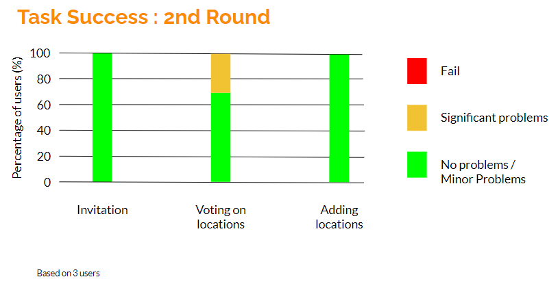
Due to time constraints on the project, I was only able to conduct the 2nd round of usability testing with 3 users. The results so far have proven to be rather promising. Users highlighted that there was a clear path and the empty state help direct them to what they need. However, some icons and words were still misinterpreted and would require to be worked on more.
The next steps that I would take would be to complete the 2nd round of usability testing to get conclusive data and validate that the improvement was a success. Afterwards, I would focus on areas where users still faced issues and then create a high-fi prototype.